Style guide
This guide is intended for the local organizers of a MIDL conference. In the interest of recognizability and a professional appearance, the following style rules should be adhered to when creating materials for the conference. This includes all kinds of print materials, such as the conference or the badges, but also digital materials, such as powerpoint slides or the website.
Fonts
Please use exclusively the following fonts:
- On screens (website, slides, etc): Roboto for text blocks, Lato for headings and any enlarged text. If in doubt, use Lato.
- In print: Lato ≥ 2.0 for both text and headings.
- The MIDL logo uses Gill Sans MT, but this font should not be used anywhere else.
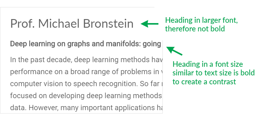
Use bold and italic text as little as possible, with a few exceptions:
- Bold text may be used to create a contrast between text and headings of similar font size, or for inline headings (e.g., "Time: 15:00").
- Bold and italics may be used sparingly for highlighting words in longer paragraphs.
- When spelling out MIDL, use capital letters for M, I, D and L, but do not highlight these letters in bold or italics:
- Incorrect: "Medical imaging with deep learning"
- Incorrect: "Medical Imaging with Deep Learning"
- Correct: "Medical Imaging with Deep Learning"
Colors
Each year's edition has a primary color (the conference color).
- Avoid the use of colors other than the conference color, white, black and gray.
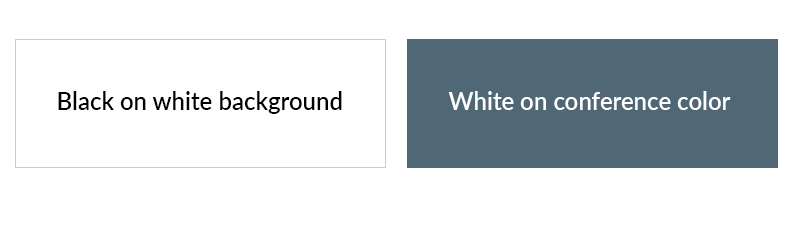
- Text should be preferably black or dark gray on white background, or white on a background in conference color.
- Text in conference color on a white background can be used to highlight certain elements.
- The logo should be white on conference color wherever possible, but can also be used in conference color on white. Do not use a black or gray logo if possible.
- Light gray lines can be used to separate different content areas.
Logo
The logo consists of three elements:
- The abstract network icon on top.
- Below, the letters "MIDL".
- At the bottom, the city name and year.
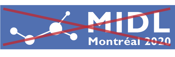
The logo is provided by the MIDL society and should not be altered in any way.
- In particular, avoid rearranging elements of the logo, such as placing the network icon next to the letters "MIDL":
- The logo should always have a clear margin to other objects and to the border of the page.
- The network icon can also be used on its own, with a clear margin to other objects.
- The logo can be used without city + year, but the network icon should always be part of the logo.
Website
The websites use a system that ensures a consistent layout of all MIDL conference websites (namely the MIDL website builder and the MIDL website theme). In addition to the above styling rules, please try to follow the styling of the websites of previous years as closely as possible.